 Bookbndr
What you'll do: set the main reading font, its size, and the spacing between lines — the settings that most affect how comfortable your book is to read.
These are in Body typography on the Design step.
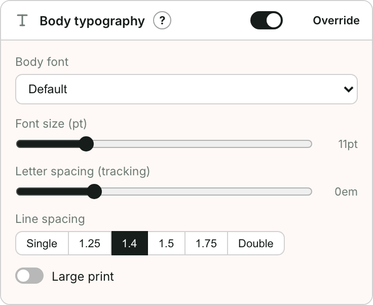
The controls
- Go to Design and open Body typography.
- Body font — choose the typeface for your main text. Serif fonts (with little feet on the letters) are traditional for novels; sans-serif feels more modern.
- Font size — drag the slider. For print this is a real point size; in the EPUB it's a starting size the reader can still change.
- Line spacing — the gap between lines. Single is tight; 1.5 or Double is more airy and easier on the eye.
- Large print — turn on for an accessible large-print edition.
Tips
- Don't over-think the e-book size — readers adjust it themselves. It matters much more for the print PDF.
- Heading sizes are set separately, relative to the body, under Heading scale — see Style your headings.
- Changes show live in the preview — try a couple of devices to be sure.