 Bookbndr
In plain terms: a drop cap is a large decorative first letter at the start of a chapter that "drops" down across the first few lines of text.
It's one of the oldest touches in book design — it signals "a new chapter begins here" and adds a sense of craft.
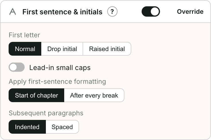
Drop vs raised
- A drop initial (the true drop cap) sinks down into the paragraph, its top aligned with the first line.
- A raised initial sits on the first line and rises above it.
Both make a strong opening; raised initials can be easier to fit when a font's drop cap looks cramped.
A nice pairing
Drop caps look especially good with the first few words in small capitals — a "lead-in". Bookbndr offers this as a separate option.
→ To add one: Add a drop cap or decorative first letter.