 Bookbndr
What you'll do: start your chapters with a large decorative first letter — a classic, polished touch.
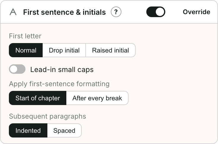
This is in First sentence & initials on the Design step. See What is a drop cap? for the idea.
Steps
- Go to Design and open First sentence & initials.
- Set First letter to:
- Drop initial — a big letter that sinks down into the first few lines (a true drop cap), or
- Raised initial — a big letter that sits on the baseline and rises above the line, or
- Normal — no special first letter.
- Choose the Initial font — keep Default to follow your chapter title font, or pick a different one.
Finishing touches
- Lead-in small caps — set the first few words in small capitals, which pairs beautifully with a drop cap.
- Apply first-sentence formatting — only at the start of a chapter, or after every break (scene break).
- Subsequent paragraphs — indented (traditional) or spaced apart.
Check the preview: drop caps can look cramped with some fonts, so try the Raised initial option if the drop doesn't sit well.